How to Make a Statement with a Bold-Coloured Armchair
Looking to breathe new life into your interior with a single standout piece? A bold-coloured armchair might be just what your space needs. Far beyond function, it’s a stylish statement that can instantly transform a room. Whether you go for emerald green, mustard yellow, or deep navy, a vibrant chair draws the eye, adds personality, and injects energy into any setting. In this guide, we’ll show you how to style it with confidence and make it the true star of your home.
The Power of Bold-Coloured Furniture
There’s a certain thrill in decorating with bold colours — and few items make a louder, more stylish statement than a bold-coloured armchair. Whether you're revitalising a tired corner or adding character to a minimalistic layout, a vibrant armchair does more than fill a space — it tells a story. It reflects your personality, sets the tone of the room, and anchors the design.
Bold colours aren’t just about aesthetic appeal; they bring emotional energy to your home. A well-placed chair in mustard yellow, forest green, sapphire blue, or burnt orange can brighten moods, spark conversation, and create a visual focus that draws the eye and holds it.
In this guide, we’ll explore how to turn a bold-coloured armchair into the showpiece your home deserves — through thoughtful placement, balanced design, and fearless personal expression.
Choosing the Right Colour for Your Armchair
Understanding Colour Psychology
Every colour evokes a mood. Knowing this helps you choose the right shade for your intended space:
-
Red & Burgundy: Passionate, energising, and commanding.
-
Blue Tones: Calming, serene, ideal for tranquil spaces.
-
Green Hues: Balancing, natural, works well with wood or plants.
-
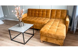
Yellows & Oranges: Warm, welcoming, great for social areas.
Matching with Your Interior Theme
Pick a colour that complements — or intentionally contrasts — your existing palette. If your space features neutral tones, an emerald or deep navy armchair will offer beautiful contrast. In rooms with warm wood or terracotta, rust or mustard chairs blend while still popping.
Timeless vs. Trendy Colours
Jewel tones like sapphire, emerald, and ruby often feel timeless, while pastel brights or ultra-vivid neons lean trendy. Ask yourself if you’re choosing a colour because it’s popular or because it truly resonates with your style.
Ideal Materials & Fabrics for Bold-Coloured Armchairs
Velvet, Bouclé, Linen, Leather
-
Velvet intensifies colour and adds luxe appeal — ideal for jewel-toned statement chairs.
-
Bouclé or wool adds cosy, textured richness to earth-toned armchairs.
-
Linen makes bold colours feel breezy and modern.
-
Leather in bold hues delivers a retro or industrial edge, depending on the styling.
How Texture Influences Perception
Texture alters how colour is perceived. A glossy leather chair in red feels intense and dramatic, while a rust-orange bouclé feels earthy and inviting. Consider both visual and tactile elements — a good armchair should look and feel inviting.
Selecting the Perfect Armchair Design
Mid-Century Modern
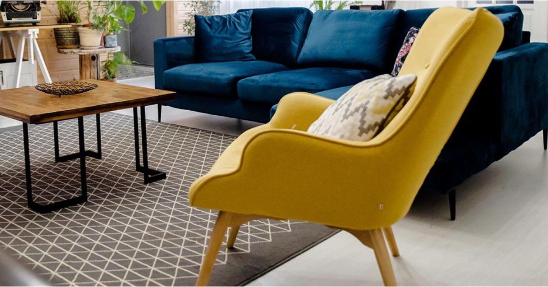
Mid-century designs, with their clean lines, tapered legs, and ergonomic forms, pair exceptionally well with bold colours. A mustard yellow or teal blue armchair in this style offers a nostalgic nod to retro design while feeling contemporary and fresh.
Wingback & Classic Styles
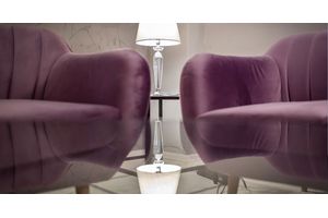
These traditional forms exude elegance. When covered in a bold colour like deep plum or royal blue, the juxtaposition of classic form and modern hue adds an upscale twist to a room.
Contemporary & Minimalist Shapes
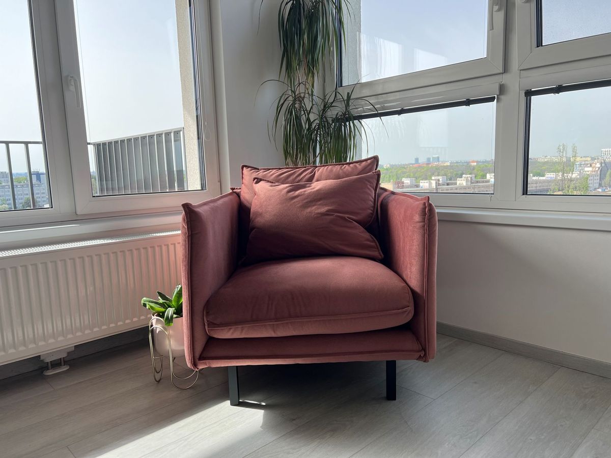
Sleek, low-profile armchairs in bold hues work beautifully in modern spaces. Think sharp edges, slim profiles, and smooth fabric in colours like saffron, forest green, or even crimson — ideal for creating visual interest without disrupting a minimalist aesthetic.
Where to Place a Bold-Coloured Armchair
Living Room Focal Points
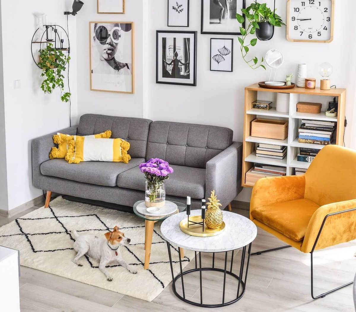
Place the chair across from the sofa or near the fireplace. Let it anchor a conversational area with a neutral rug beneath and a chic floor lamp above.
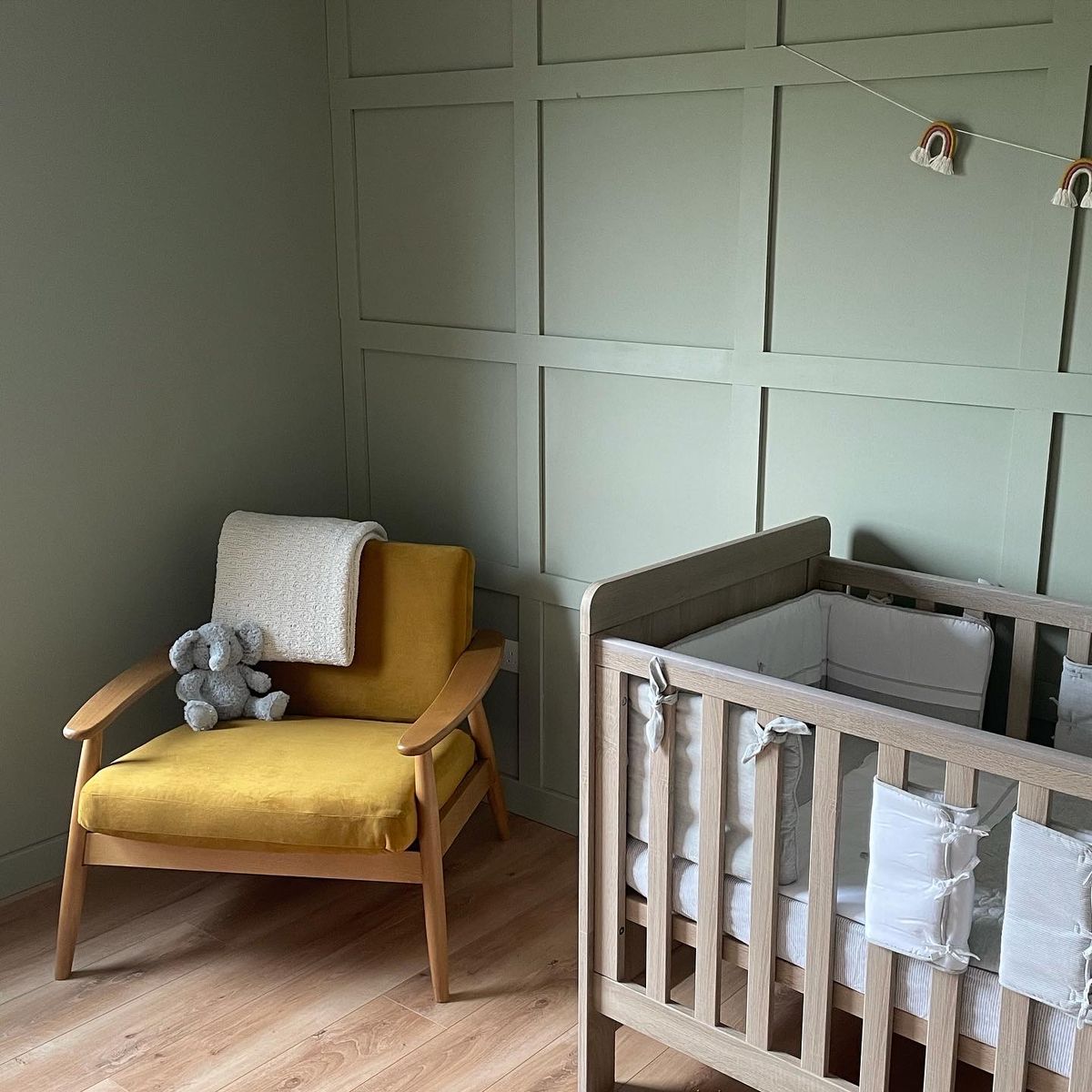
Bedroom Corners
Use a colourful armchair to fill empty corners and create a mini reading nook. Position it near a window or vanity for added functionality and visual intrigue.
Reading Nooks & Entryways
A vibrant chair can signal warmth and hospitality in an entryway, or lend a sense of calm to a reading nook. In both scenarios, keep surrounding décor minimal so the chair becomes the clear focus.
Creating Visual Balance with Neutral Backdrops
Bold colours need room to breathe — and soft, neutral tones provide the perfect canvas. Creams, taupes, light greys, and warm beiges allow the chair to shine.
Pairing your armchair with pale walls and neutral floors prevents visual competition. Even if your space includes wood accents or exposed brick, the chair can pop against the organic textures.
Use neutrals not just on walls, but in nearby furniture, like beige side tables or grey sofas. This contrast enhances the chair’s role as the centrepiece without disrupting harmony.
Layering Accessories for Cohesion
Cushions, Throws & Rugs
Enhance your bold-coloured chair with accessories that either:
-
Echo the colour in a lighter/darker shade.
-
Contrast it with complementary hues (e.g., blue chair + orange throw).
Layering a few textures — a knitted throw, a velvet cushion, or a patterned rug — ties the look together and makes the area feel styled but lived-in.
Wall Art & Decorative Objects
Use artwork that picks up on your chair’s colour subtly. A canvas with hints of teal or a vase in complementary hues can reinforce the palette without becoming overwhelming.
Repeating Tones Strategically
The secret to a polished look? Repetition. Include the armchair’s hue in small doses throughout the space — in bookshelves, picture frames, or pottery. This creates visual rhythm and intentionality.
Lighting Considerations for Bold Furniture
Natural vs. Artificial Light
Lighting determines how the colour of your armchair is perceived:
-
Natural light makes colours feel lighter and more vibrant.
-
Artificial light can deepen or warm tones, depending on the bulb.
A ruby-red chair may appear fiery at noon but rich and sultry under soft lamplight.
Positioning Near Windows
Place your chair near large windows to benefit from daylight. Use sheer curtains if needed to soften direct glare, which can fade bright upholstery over time.
Lamps & Mood Lighting
Install floor or table lamps with warm bulbs nearby. Dimmable options give you control over ambiance — ideal for changing moods from day to night. For cool-toned chairs, warmer lighting adds balance and cosiness.
Using Bold Colours in Small Spaces
Many shy away from using bold colours in compact rooms — but with the right techniques, a bold armchair can make a small space feel more dynamic, not crowded.
Space-Enhancing Techniques
-
Choose low-profile chairs to avoid visual heaviness.
-
Place the chair in a corner with a neutral rug beneath to define the area.
-
Use mirrors nearby to reflect the chair’s colour and add depth.
Avoiding Visual Overwhelm
Don’t pair your bold chair with equally loud elements. Skip large patterns or colourful wall art in close proximity. Instead, create negative space around the chair, letting it shine as a singular feature.
Mixing and Matching with Other Bold Elements
When to Mix Colours
It’s entirely possible to have more than one bold colour — the trick is balance. Pair jewel tones together (e.g., emerald + sapphire), or mix a bold chair with vibrant art if the rest of the space is neutral.
Combining Patterns and Textures
Patterns can work well with bold armchairs — especially in rugs, curtains, or scatter cushions — but limit large-scale patterns near the chair. Stick to one dominant colour family for cohesion.
Use different textures (e.g., matte walls, glossy ceramics, soft upholstery) to build layers and create a curated look.
Mistakes to Avoid When Styling Bold-Coloured Chairs
Choosing a bold armchair is exciting, but styling it incorrectly can reduce its impact or make your space feel chaotic. Here are some of the most common pitfalls — and how to avoid them.
1. Overcrowding the Space
A bold armchair needs breathing room. Avoid placing it in an area already filled with colour, pattern, or visual “noise.” Instead of blending into a busy corner, give your statement chair its own stage with minimal clutter and complementary tones.
Tip: Stick to clean, open surroundings with selective accessories. A small side table, soft throw, and nearby plant are often all it needs.
2. Ignoring Lighting Effects
Lighting completely alters how a bold colour is perceived. Many people forget to assess how daylight or artificial light impacts the chair’s hue, which can lead to unexpected results.
Solution: View fabric swatches in both natural and artificial light before choosing your chair. Test its placement at different times of day to see how the colour evolves.
3. Clashing Colour Choices
It’s tempting to add other bright elements once you introduce a bold chair — but going too far with other strong hues can clash or overwhelm the space. Mixing warm and cool bold tones without a plan leads to visual chaos.
Fix: Stick to one primary bold hue and repeat it subtly across other elements. If you want to add another strong colour, use the colour wheel to find a complementary shade and apply it sparingly.
4. Choosing the Wrong Fabric for the Setting
An eye-catching velvet chair might look stunning online, but if it’s being placed in a sun-drenched conservatory, the fabric might fade or feel too warm. Similarly, a delicate linen chair might struggle in high-traffic areas.
Remedy: Match fabric with function. For high-traffic rooms, consider durable, easy-clean fabrics. Reserve luxe or delicate materials for lower-use zones.
5. Letting the Chair Blend in Too Much
It sounds ironic, but some bold chairs can get “lost” if the surrounding palette isn’t quite right. For example, a navy chair against dark grey walls may not offer the intended contrast.
Pro Tip: Use contrasting backdrops or place your chair near lighter elements to ensure it truly stands out as a feature piece.
Why Bold-Coloured Armchairs Work for Every Interior Style
One of the best things about bold-coloured armchairs is their incredible versatility. Regardless of your interior design style, there’s always a way to integrate a vibrant piece and let it shine.
1. Scandinavian Minimalism
Scandi interiors are known for light colours, clean lines, and natural textures. A mustard yellow or rust-orange armchair placed against a pale wall introduces warmth and contrast without overpowering the soft, airy atmosphere.
Pair with: White walls, light wood furniture, and cosy textures like sheepskin or wool.
2. Industrial Interiors
Industrial spaces often feature darker tones, exposed brick, and metal. A bold teal or deep green armchair offers the perfect dose of colour amidst greys and raw materials. The contrast creates a bold visual anchor while softening the room’s harder elements.
Pair with: Black metal frames, Edison bulbs, and reclaimed wood accents.
3. Bohemian & Eclectic Styles
Boho décor thrives on colour and character, making bold chairs a natural fit. Whether it's a vivid magenta velvet or patterned indigo linen, these chairs add soul to the layered, global-inspired look.
Pair with: Layered rugs, houseplants, ethnic textiles, and eclectic art.
4. Classic & Traditional Homes
Even in more traditional spaces, bold armchairs add flair. A deep sapphire wingback in a room of antique wood furniture or a plum tufted chair beside a marble fireplace adds just enough drama to refresh the space without clashing with its formality.
→ Explore the Ducon Velvet Wingback Chair
Pair with: Rich drapes, ornate lighting, and oil paintings.
5. Contemporary & Urban Styles
Sleek modern homes can sometimes feel too clinical. A bold statement chair introduces personality, breaks up monotony, and offers a focal point. A minimalist chair in fire-engine red or cobalt blue looks striking in an otherwise monochrome room.
Pair with: Monochrome colour schemes, glass or metal accents, and sculptural lighting.
Make Your Bold Choice with Confidence
A bold-coloured armchair isn’t just a decorative choice — it’s a declaration of style, confidence, and creativity. Whether your home is filled with neutral tones or brimming with eclectic charm, the right armchair can anchor your design, shift the room’s energy, and inject warmth or drama exactly where it's needed.
The secret to making it work? Thoughtful styling. Choose a colour that resonates emotionally and visually. Let the chair breathe in your space. Surround it with textures, soft lighting, and subtle repetitions of colour to create cohesion. Avoid over-cluttering or mismatched tones — and remember that lighting is just as important as colour itself.
Above all, trust your instincts. A bold armchair should reflect your taste, not someone else’s trend list. By blending good design principles with a dose of fearless expression, you can transform any corner into a standout feature that speaks volumes — without saying a word.
So go ahead — choose that plum velvet wingback or teal linen modern silhouette. Let it become the heart of your room. You’ll be surprised just how much one chair can do.