The Art of Color: How to Choose a Color Palette for Interior Design
Interior design is a captivating process in which color plays a pivotal role. Colors enable us to express our creativity, create an atmosphere, and infuse interiors with a personal character. The right selection of a color palette can make a space cozy, inspiring, or brimming with energy. Understanding the significance of color in interior design, the purpose of this article, and examples of how colors influence the ambiance of a room will guide you in mastering this art.
The Psychology of Colors
The Relevance of Color Psychology in Interior Design
Color psychology is the science of how colors influence human behavior and emotions. In interior design, understanding color psychology is paramount. For instance, red can stimulate and increase appetite, while blue has a calming effect. Choosing colors in line with the intended effect can impact the occupants of the space.
Basic Emotions and Associations with Different Colors
Each color evokes specific emotions and associations. Red exudes passion and energy, while blue is associated with tranquility and unbeatable harmony. When designing interiors, it's essential to know that when selecting a color, you are also choosing the emotions you want to convey.
How Color Selection Can Impact Our Well-being
By choosing colors for interior spaces, we can influence our daily well-being. Bright, warm colors can make us feel more joyful and energetic, while subdued, cool colors can aid in relaxation and peace. For example, in a bedroom, the choice of color can impact the quality of sleep and the overall atmosphere of relaxation.
Color Harmony
Theory of Color Wheels
The theory of color wheels serves as the foundation for designing a harmonious color palette. The color wheel is a tool that logically groups colors, considering their relationships and contrasts. Using the theory of color harmony allows you to create aesthetic, cohesive color combinations.
Examples of Harmonious Color Combinations
Harmonious color combinations enable the creation of cohesive and aesthetic interiors. Examples of such combinations include:
Complementary Combinations: Choosing colors that are opposite each other on the color wheel, such as red and green. These colors complement each other, creating a dynamic effect.
Analogous Combinations: Selecting colors that are adjacent on the color wheel, such as various shades of blue. These combinations are calm and harmonious, ideal for spaces that exude tranquility.
Triadic Combinations: Choosing three colors evenly spaced on the color wheel. These combinations are typically vibrant and full of energy.
Applying Color Harmony in Interior Design
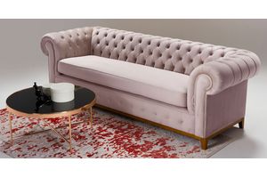
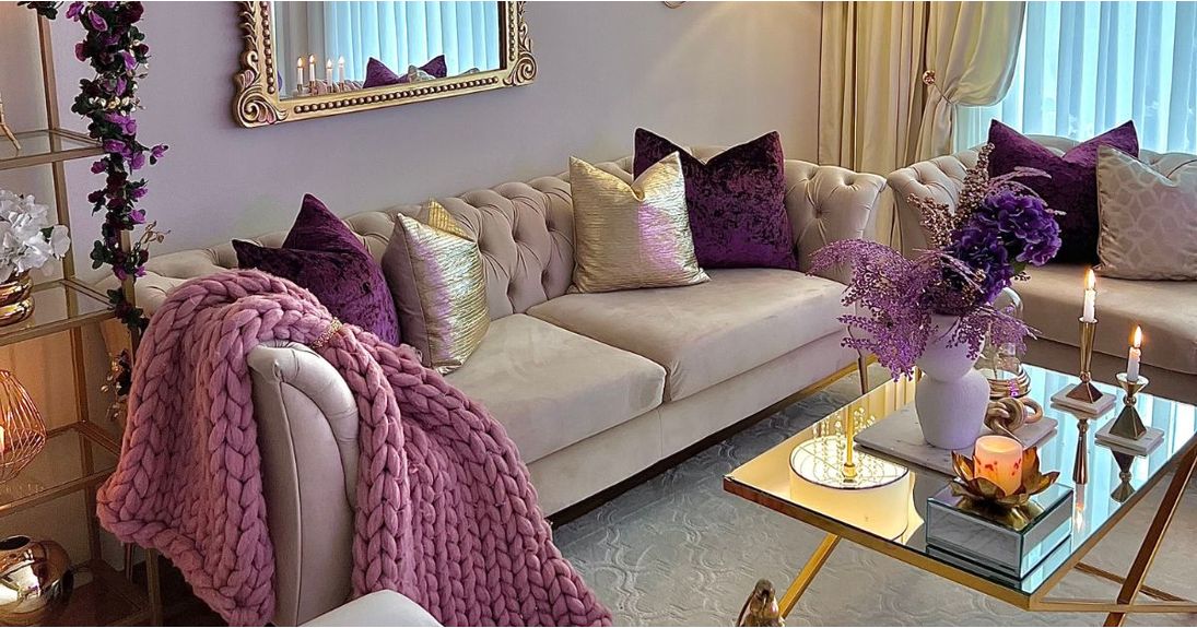
A practical example of applying the theory of color harmony in interior design is the Baron Left Hand Corner Sofa. Thanks to the precise selection of a harmonious color palette, this piece of furniture becomes not only a practical element of the interior but also an aesthetic accent that seamlessly blends with the overall character of the room.
Choosing the Main Color
Analyzing Existing Elements in the Room
When selecting the main color, it's crucial to consider the existing elements in the room. Existing furniture, flooring, or decorative elements already establish the current color reference point, which must be taken into account.
Determining the Function and Character of the Space
The main color should also be tailored to the function and character of the room. A kitchen may require a different color scheme than a bedroom, and a child's room may demand more vibrant and cheerful colors.
Examples of Popular Main Colors and Their Applications
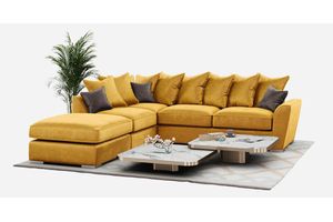
A popular example of a main color is yellow, which adds energy and warmth to the interior. The Right Hand Corner Sofa in yellow can serve as a unique accent in a modern living room. It not only adds color but also imparts character to the room.
Additional Colors and Accents
Choosing Additional Colors
When selecting additional colors, it's essential to ensure they harmonize with the main color. Additional colors can be used on walls, in decorative accessories, or textiles.
Using Accent Colors
Accent colors allow you to emphasize specific elements in a room. For instance, wall niches, decorations, or furniture can become focal points, highlighted through color choices.
The Role of Additional Colors in Creating Contrasts and Harmony
Balanced use of additional colors can create both contrasts that capture attention and harmony that introduces coherence and aesthetics.
Light and Color
The Influence of Lighting on Color Perception
Lighting significantly impacts color perception. How a color appears can depend on the source of light. Natural light adds warmth and naturalness to colors, while artificial light can introduce tonal differences.
Selecting Colors Based on Lighting Availability
When designing the color scheme for an interior, it's vital to consider the availability of light. In spaces with limited lighting, bright colors can brighten the area, while well-lit spaces offer opportunities to experiment with darker shades.
Choosing the Type of Lighting for Specific Colors
When choosing the type of lighting, it's advisable to tailor it to the color scheme of the room. Warm lighting can emphasize warm colors, while cool lighting complements cool tones.
Practical Tips
Sample Tools for Color Design
Interior color design can be facilitated using various tools. Color catalogs, color samples, and interior design applications assist in experimenting with a color palette and visualizing the effects.
Testing Color Samples
Testing color samples on small sections of a wall can help avoid disappointments after painting an entire room. Lighting, materials, and other factors can influence the final color effect.
Choosing Durable Materials and Finishes
The selection of durable materials and finishes is crucial to maintaining color longevity. High-quality paints and damage-resistant finishes allow for long-lasting enjoyment of the interior color.
Interior Color Design Trends
Current Trends in Interior Color Schemes
Interior color schemes are subject to evolving trends. Presently, muted pastel colors are in vogue, creating an atmosphere of tranquility and elegance. Interior color design trends increasingly emphasize sustainability and environmentally-friendly practices.
Color is a fundamental aspect of interior design, influencing the atmosphere, the well-being of the occupants, and the overall aesthetics of a space. When choosing colors, it's essential to consider both color psychology and color harmony principles. Inspiring trends enable the creation of original and stylish interiors. Designing with color can be a creative process that allows for self-expression and personal style in interior design.